GTAM Logo Contest!! | Page 9 | GTAMotorcycle.com

GTAM Logo Contest!!

Status
Not open for further replies.
Thought I'd try to add some colour into this one. Also tried to make the G look more like a hand by making the knuckles different heights like a real hand. Also tried a version where I added a throttle.

GTAM1ey3_4b_zps69195771.jpg

I don't know why people like this one, it has a transformers vibe and does not come across as motorcycle related at all.
 
Last edited:
My fav still...

GTAM1ey3_comp4_zps141090f2.jpg


2nd fav...

GTAM1ey3_3_zpsec5bc8f0.jpg


Maybe some one could combine them...now that would be cool.
 
Here's what it looks like with the effects on my design:

u8CRUZQ.png

aNpfin3.png


I approve.

My OCD is telling me you need to fix the gap between GTAM and the bike to match the gap between the letters.

I also took the liberty of fixing the gap
 
Last edited:
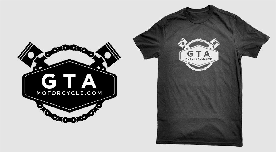
Regardless of what we choose....I'd still like to use this on Tshirts.

Ok cool...I'll be ordering one then
 
Here's a variation of Matt's.

4uvute5e.jpg

Some kerning and possibly a lighter face will go a long way towards making it properly legible at all scales. Dump the fade/gradient for the same reason.
 
Status
Not open for further replies.

Back
Top Bottom