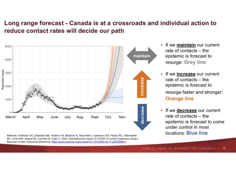
Cormac Mac Sweeney tweeted this image purported from Public Health Agency of Canada. Interesting graphic but almost useless without further information. Obviously blue line is much better than grey, but how much decrease in our current rate of contact is required? Do we need to lock the doors and not go out, go back to april where one person goes to a store once a week and that is it, stop having any social visits, shut down schools, etc. etc?
The link goes to an article published in April. That article has similar graphs but obviously they only have data from April and before. I have no idea where the current image was sourced.

New model shows COVID-19 accelerating at alarming rate in Ontario
A new model released by the Public Health Agency of Canada shows how young people make up most of the provinces COVID-19 cases to date.www.680news.com


Estimating the impact of COVID-19 control measures using a Bayesian model of physical distancing
Extensive physical distancing measures are currently the primary intervention against coronavirus disease 2019 (COVID-19) worldwide. It is therefore urgent to estimate the impact such measures are having. We introduce a Bayesian epidemiological model in which a proportion of individuals are...www.medrxiv.org
I had that discussion with the Mrs. this weekend and said yes, Fewer outings.
We always wore masks and distanced but were seeing more people being casual about it, paying lip service at best. People are following rules that they don't understand and get it wrong.
People don't understand bubbles. They think they can leave one and join another.


