D
Deleted member 54626
Guest
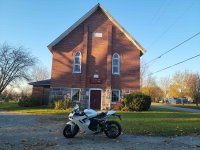
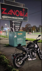
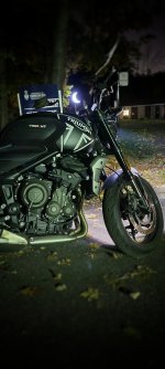
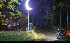
I actually saved the photo to my PC so I could really zoom in, which made matters worse. Zoomed back out and suddenly it kinda looked like....blankity-blank.But if you add in the name within the white area above the church name gets better results


